
When it comes to choosing colors, you might have come across the terms “Bone” and “Biscuit.” But what exactly do these colors mean, and how do they differ?
If you’ve ever been confused by these subtle shades or wondered which one suits your space or style better, you’re not alone. Understanding the difference between Bone and Biscuit can help you make smarter choices for your home, wardrobe, or design projects.
Keep reading, and you’ll discover how these colors can impact your look and feel—and which one might be the perfect match for you.
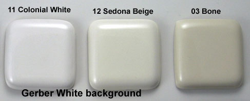
Credit: terrylove.com
Bone And Biscuit Basics
Bone and biscuit colors often confuse many people. Both are soft, neutral shades used in home decor, paint, and textiles. Understanding their differences helps you choose the right tone for your space. This section explains the basics of bone and biscuit colors.
Defining Bone Color
Bone color resembles the natural shade of animal bones. It is a pale off-white with subtle gray or beige undertones. This color feels cool and calm, making spaces appear clean and bright. Bone works well as a neutral base in any room.
Defining Biscuit Color
Biscuit color looks like baked cookies or light tan clay. It is warmer than bone, with soft brown or cream hints. Biscuit creates a cozy, inviting atmosphere. It pairs nicely with earth tones and warm woods for a natural feel.
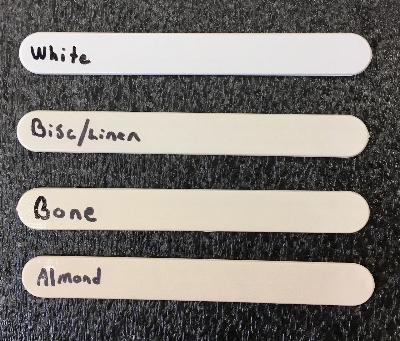
Credit: cheaptoilettanklids.com
Color Characteristics
Bone and biscuit colors often appear similar. Both are soft, light shades used in design and decor. Understanding their color traits helps choose the right one. These colors differ in hue, tone, warmth, and common variations. Knowing these details makes it easier to match colors perfectly.
Hue And Tone Differences
Bone color has a slight gray or greenish hint. Biscuit leans toward a light beige or tan shade. Bone looks more muted and subtle. Biscuit feels richer and creamier. The tone of bone is cooler, while biscuit has a warmer tone. These small differences affect how they appear in different lights.
Warmth And Coolness Levels
Bone color has cool undertones. It carries a faint gray or blue tint. Biscuit color feels warm and inviting. It includes soft brown or yellow hints. Warmth in biscuit makes spaces feel cozy. Cool bone color gives a calm, clean look. Choosing between these can change a room’s mood.
Common Variations
Bone color varies from off-white to light gray. Some versions have a slight green or blue shade. Biscuit ranges from pale tan to creamy beige. It may show soft orange or yellow tones. Both colors appear in many materials like paint and fabric. These variations add depth and interest.
Applications In Design
Bone and biscuit colors have unique roles in different design fields. These shades bring warmth and subtle elegance to many styles. Understanding their uses helps in choosing the right color for each project.
Both colors work well to create calm and inviting spaces. Designers often pick one over the other based on the mood they want to set. The slight difference in tone can change the entire look.
Interior Design Uses
Bone color creates soft, neutral backdrops in rooms. It brightens spaces without stark whiteness. Biscuit offers a cozy and earthy feel. It pairs well with wood and natural textures. Both colors suit walls, ceilings, and trims. They help highlight furniture and artwork.
Fashion And Textiles
Bone shades appear in elegant clothing and accessories. They give a clean, fresh look. Biscuit tones add warmth to fabrics like wool and cotton. These colors match well with bold or pastel shades. Designers use them for scarves, shirts, and dresses. They provide timeless style and easy coordination.
Furniture And Decor
Bone color fits modern and minimalist furniture. It creates light and airy feelings. Biscuit color suits rustic and vintage pieces. It adds depth and richness to wood finishes. Cushions, lamps, and rugs in these colors enhance room harmony. Both shades offer flexible options for decorating.
Matching And Pairing
Matching and pairing bone and biscuit colors can change the look of any space. Both shades are soft and warm but have unique tones. Choosing the right combination can create a cozy and stylish feel. Understanding how to blend these colors helps in decorating walls, furniture, or accessories.
Complementary Colors
Bone has a creamy, off-white tone that pairs well with soft pastels. Biscuit has a light brown shade that matches earth tones like olive green and terracotta. These combinations create harmony in a room. Using complementary colors brings out the best in both bone and biscuit.
Contrast And Balance
Bone is lighter and cooler than biscuit. Pairing bone with biscuit creates a nice contrast. This balance prevents a dull or flat look. Use bone on large surfaces and biscuit for smaller accents. The contrast adds depth without overwhelming the space.
Seasonal Considerations
Bone works well in spring and summer because it feels fresh and airy. Biscuit fits autumn and winter with its warm, cozy vibe. Changing accessories between these colors can reflect the seasons. This switch keeps your decor feeling current and inviting year-round.
Choosing The Right Shade
Choosing the right shade between bone and biscuit color can change a room’s look. Both shades offer warmth and softness. Yet, they create different moods. Picking the perfect shade depends on several factors. These include lighting, room size, and your personal style. Each factor helps the color blend well with your space.
Lighting Effects
Lighting plays a big role in showing true color. Bone color looks brighter under natural light. It reflects light, making rooms feel open. Biscuit color appears warmer under soft or yellow lights. It can create a cozy, inviting space. Check the lighting before choosing the shade. Test paint samples in different lights for best results.
Room Size And Ambiance
Room size affects how colors feel. Bone color suits small rooms well. It opens up tight spaces and adds airiness. Biscuit color fits larger rooms better. It adds depth and warmth to big areas. Both shades can create calm or lively ambiances. Decide the feeling you want before picking the color.
Personal Style Preferences
Your taste matters most in color choice. Bone color matches modern and minimalist styles. It pairs well with whites and cool tones. Biscuit color suits traditional and rustic decor. It blends nicely with wood and earth tones. Choose the shade that fits your style and comfort. Your space should reflect your personality.

Credit: www.ebay.com
Maintenance And Longevity
Choosing between bone and biscuit color involves thinking about how they last and stay nice over time. Both colors show wear differently, and their upkeep varies. Knowing how to care for each helps keep your space looking fresh longer.
Fading And Discoloration
Bone color may show yellowing with sun exposure. Biscuit color hides fading better due to its warmer tone. Both shades can lose brightness if exposed to strong light often. Dark stains are easier to spot on bone than biscuit.
Cleaning Tips
Use mild soap and water for both colors. Avoid harsh chemicals that cause color loss. Wipe spills quickly to prevent stains. Soft cloths work best to clean without scratching. Regular dusting keeps colors true and fresh.
Durability Factors
Material quality affects how bone and biscuit colors age. Bone may show scratches more than biscuit. Biscuit color hides dirt better, reducing visible wear. Proper sealing protects both colors from damage. Choose finishes that match your lifestyle for longer-lasting beauty.
Frequently Asked Questions
What Is The Difference Between Bone Color And Biscuit Color?
Bone color is a light off-white shade, while biscuit color has a warmer, beige tone.
Which Color Is Better For Home Decor: Bone Or Biscuit?
Bone offers a crisp, clean look; biscuit creates a cozy, warm atmosphere.
How Do Bone And Biscuit Colors Affect Room Lighting?
Bone reflects light more, making rooms appear brighter; biscuit absorbs light for softness.
Are Bone And Biscuit Colors Suitable For Furniture?
Yes, bone suits modern styles; biscuit fits traditional or rustic furniture well.
Can Bone And Biscuit Colors Be Mixed In Design?
Yes, combining them adds depth and contrast without clashing.
What Colors Pair Well With Bone And Biscuit Shades?
Both work well with grays, blues, and natural wood tones.
Conclusion
Bone and biscuit colors both offer soft, warm tones for spaces. Bone leans more toward off-white with subtle gray hints. Biscuit shows a creamy beige shade with slight yellow warmth. Choosing depends on your room’s lighting and style. Bone suits cooler, modern settings well.
Biscuit fits cozy, traditional spaces nicely. Both colors bring calm and comfort. Test samples before deciding. Small details make a big difference. Choose the shade that feels right for you. Simple choices create beautiful rooms.